Interview with David David designer, David Saunders

Do you have a particular favourite Johnson Tiles product?
The Prismatics range is mega; I love the colours and the dimensions of the tile. It also matches a great period in tile design history, which reminds me of railway stations and public building in the 1930s.
What are you currently working on aside from the LDF project?
We are working on our new umbrella range, which is really exciting. The umbrella is a fantastic vehicle for showcasing and enjoying print. It enables someone who is more conservative in the way that they dress, to splash a bit of colour in their life, plus the print makes an otherwise rainy day brighter. We are also extending our range and developing the new interior products. I really love furniture too, so I’m looking for designers and brands that would be good to work with.

How important is it for designers to work with other brands and manufacturers on collaborations?
I think it’s really important, and part of what makes design rewarding. It's essential to me to explore and find new things to enjoy and create. We humans are naturally inquisitive and I don’t think we are designed to stick to just one thing. I believe that the ‘seven year itch’ isn’t just connected to relationships, but that it is connected to creativity too. Collaborations like this one are also amazing opportunities for our brand to reach a new audience. You also get to hang out with some new people and play with some new toys!!
Which design trends are currently inspiring your work?
I’ve always loved film. I made a lot of video art at college and we’ve really enjoyed working with a bunch of directors on some promos for our brand. I like the way film has become an integral part of showing your work to the world. I’m also really happy to see that print is in fashion again, to offset the minimal focus that has been staple for a while. Of course they can both sit comfortably together. There is something great about the idea of a purist white room and a very loud print sofa in the centre – it’s like a work of art hanging on the wall.
Who or what would you state as your biggest inspiration?
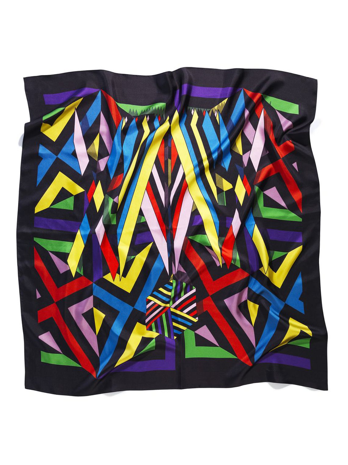
Daydreaming and its abstract tangents that take me from a girl’s figure I’ve seen on the street, to the slow curve of a pattern in one quick move. The triangle and its ability to reproduce and repeat – stripes and their beautiful simplicity.

Why did you choose Carousel as the main inspiration for The London Design Festival mural?
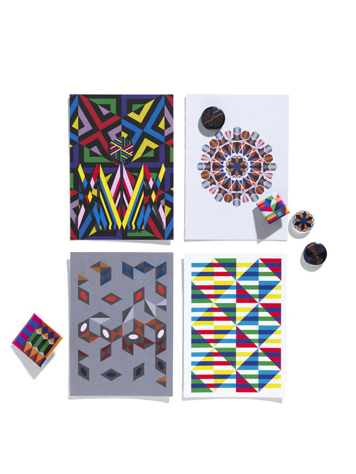
It’s a print that is perfect for tiles. The design is inspired by Islamic print, which I think is the most explorative of tile designs. It’s also one of my more decorative prints and speaks volumes to me. There is a lot of movement in the design and I feel that it’s spinning, breathing and living. This is great for a static space like the V&A's tunnel entrance – it gives the space a story that can be explored close-up or from a distance.
Can you talk us through the process of taking a design and adapting it for such a huge space as the V&A tunnel?
It’s about infinity, I guess – the importance of creating a repeat pattern for me is not being able to spot the repeat point. That is where geometrics are beautiful as they celebrate repetition; it is integral to its design. I have broken up the wall into a couple of different points in order to give room for the repeat pattern to flow, and at certain points there is space for other works or art to be shown – whether it be flowers or framed art. I wanted the space to be enveloped with the print; I wanted the walls to be absorbed into the print as if it were part of the foundations of the space.

Do you have a process for choosing which colours will feature in your designs?
For this particular project I took inspiration from the colours of the Johnson Tiles’ Prismatic range. More generally, my range of colours is an on-going evolution, as are my patterns. I have one palette, which I would call my staple, and I add colours to it depending on the mood of the product I am working on.
Most of everything I do is a process, and an exploration. I don’t sit down each season with a new idea; I use my last collection of prints as an inspiration for the next. So it will probably start by taking one of my existing prints and completely breaking it down and reconstructing it. Geometry enables me to constantly find new ways of altering patterns; it’s like an Aladdin’s cave of possibilities.

How did the Johnson Tiles collaboration come about?
We are a print brand – that is my passion. The great thing about print is that it is so diverse you can splash it onto almost anything. Ceramics are gorgeous objects with a degree of permanence. They hold their own and can make a room explode simply by sitting in them.
Tiles have always been something that I’d wanted to work with. It’s where I first discovered geometrics, or first enjoyed them as an art form. Going into an Islamic building and seeing the clean and concise decoration, using geometrics, is quite awe inspiring. I have always been a sucker for attention to detail, angles, lines, balance mathematics and patterns in all that we see - I find myself automatically looking for a pattern in everything.
I love the way that tiles can cover and unite an entire space, or can be a small piece of decoration.
I wanted to work with Johnson Tiles specifically, as it is the leading British Tile manufacturer. They make beautiful products, they are engaged with making the best quality products on the market and their customers and heritage are their most important factors.
I love the way they are giving something back in terms of engaging with new designers, whilst being interested in projects not solely for commercial gain. Johnson Tiles has also been Sunday Times’ greenest UK company for four years in a row, which is an acknowledgement for something incredible that has been at the forefront of their interest long before it was publicly necessary for a company to take those steps.

Can you briefly explain the background to how David David came to be?
I guess there were a couple of reasons. First of all was the desire to make a mark. I had been working for other artists for a couple of years, and I admired their ability to get their personality and message across. It made me want to do the same.
The path my work took was quite unexpected, I always imagined I would be a fine artist but fashion came a ‘knocking. I just had a party to go to and nothing to wear, so I made myself a hat and a t-shirt and everyone loved it, bingo!

At Johnson Tiles we've turned our attention to design season and particularly The London Design Festival. From 13-21 September, the 50 sq m Carousel Wall mural in partnership with London design studio David David, will cover the Exhibition Road tunnel entrance to the V&A.
The bold, geometric design of the mural is based on an adaptation of Carousel (2011), the Jameel Prize-nominated work of David David co-founder David Saunders. In anticipation of the festival, and to celebrate our creative partnership, we asked David to share an insight into his inspiration and influences.


